.png)

.png)
Project Overview
Challenge
DemocracyLab is a nonprofit that helps tech for good projects launch by connecting skilled volunteers to projects that need them.
Currently the DemocracyLab platform is lacking an alerts system that will allow volunteers to receive notifications once projects of their interest become available. With many projects looking for the skills of mighty volunteers, DemocracyLab wants to increase volunteer engagement and participation.
Objective
Design a simple, intuitive, and personalizable alerts system that connects volunteers with available projects on DemocracyLab.
Project Type
Add a Feature, UX Volunteer Project with DemocracyLab
Role
UX Designer, UX Researcher
Team
Myself & 3 UX Designers
Collaborating with cross-functional teams like PM, UX Research, UX Writing, and Dev.
Duration
5 months
(July 2021 to Nov 2021)
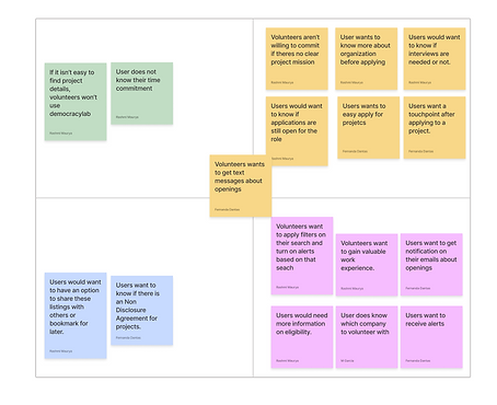
Understanding the Problem Space
Some initial research was conducted by the UX Research team at DemocracyLab but our team wanted to conduct additional research to better understand our problem space so that we could design a better solution for users.
Competitive Analysis
To begin our research, our team started out by looking at direct and non-direct competitors in the market. We wanted to understand how other competitors are currently notifying users of potential openings that are of interest to them. We were also interested in uncovering competitors' strengths and weaknesses.
After conducting our analysis, we developed a simple features matrix to showcase where DemocracyLab's platform stands in comparison to others in regards to alert features.


Assumption Mapping
My team also met for an assumptions mapping session leading to valuable discussions amongst the team about user needs and risks associated with finding solutions to address these needs.

.png)
User Flows
User flows were created to better understand where alerts might best fit into the platform.

Designing
Sketches
Each team member sketched up some ideas of what they envisioned the alerts feature to look like. Afterwards, we got together to present and share our thoughts.
We also presented the sketches in our weekly design stand-up meetings to gather feedback on our designs from designers, developers and other cross-functional teammates.
Here are some of my sketches!


Prototyping
Being that the team was split between two designs, we decided to split prototype both so that we could conduct testing on both versions which would ultimately allow users to choose what suits them best.
Version A Screens

Version B Screens

Testing
Unmoderated Remote Usability Testing
Using the Maze platform, we tested Version A and Version B with volunteers of DemocracyLab.
Tests for both versions consisted of the same tasks. Our team wanted to see which version generated more positive user feedback and was more intuitive for users.
Test A had a total of 42 respondents while Test B had a total of 24 respondents.
Ultimately, more participants were able to successfully complete the tasks on Version A as opposed to Version B. When analyzing the heat maps of both Versions, more misclicks were noted on Version B.

Key Insights
Proposed Changes
Finding the alerts settings proved to be challenging for some users.
Users had difficulty locating where to manage alert settings. It wasn’t apparent to users that clicking on the profile icon would bring users to a menu with an 'alerts setting' option.
Users get overwhelmed if too much information is shown at once.
Having alerts settings as part of profile settings resulted in too much information being displayed to users at once. Users found it difficult to pinpoint where exactly they could edit their alerts and also reported feeling overwhelmed by the content.
Users prefer a more accurate description for the toggle button.
Rather than having a simple ‘alerts’ label next to the toggle, users prefer to have a more descriptive label so they could anticipate what might happen if they toggle the button.
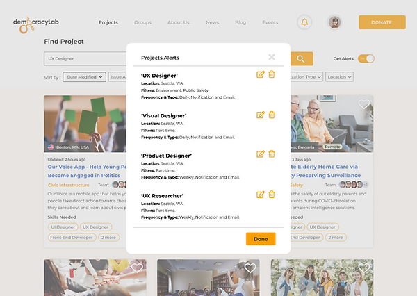
Incorporating a bell notification icon in the top upper horizontal menu bar.
Most users associate a bell icon to notifications or alerts. Upon clicking on the bell icon, a menu will populate allowing users to select an 'edit alerts' option.
Having a feature solely for alerts settings.
Implementing an entirely separate portion of the site that focuses on alert settings management cuts down the amount of information shown to users at one given time.
Editing the label of the toggle button to be more specific.
Changing the label to 'get alerts' tells users exactly what to exact if they were to toggle the button.
Iteration
Since Version A appeared to receive more positive review and feedback amongst our users, we focused on fine-tuning and reiterating Version A based on user feedback.
Our team also tweaked some interface design to match DemocracyLab's existing design system.
Some features of Version B were well received by users, so we also incorporated some aspects of Version B's design into Version A.
Change #1: Incorporating a Bell Notifications Icon in the Homepage.


Change #2: Editing the Alerts Toggle Button Label to be More Precise & Accurate


Change #3: Redesigning our toast notifications to include precise date and times.


Change #4: Incorporating filter settings from Version B into Version A's design.


Final Screens


Reflections
Next Steps
-
Moderated Usability Testing: With the updated prototype, more testing should be done to gain user feedback on iterations. While non-moderated usability testing can be convenient & quick, the truth is, at times, it doesn't beat moderated sessions. Our team would love to gain more high quality qualitative feedback through additional testing.
-
Focusing on Building out the Feature on Mobile: DemocracyLab's mobile platform currently still lacks a notifications system. The next step would be to design this feature while taking into account limitations of a mobile interface.
Learnings
-
Working around Constraints of Design Systems: Design Systems are wonderful, but are still rules! They design what you're able to do and how you should design. At times, they could reduce your ability to be creative since you still have to follow guidelines. In this project, I learned to love the constraints of a design system as it promotes consistency and reduces building time!
-
Working with Cross-Functional Teams: During this project, I had the pleasure of working with various cross-functional teams which proved to be super fun. Working with the development team at DemocracyLab enabled me to design a feature that was feasible to build. Good communication was key in getting us on the same page of how we wanted the designs to be built out.